Responsive web design involves crafting web pages that appear appealing and functional on various devices.
Responsive web design automatically adapts to various screen sizes and viewports.
What is Responsive Web Design?
Responsive Web Design is about using HTML and CSS to automatically resize, hide, shrink, or enlarge,
a website, to make it look good on all devices (desktops, tablets, and phones):
Setting The Viewport
For a website that works well on different devices, include this <meta>
tag on all your web pages:
By doing this, you're basically telling the browser how to manage the size and scaling of your page.
Here's a comparison between a webpage without the viewport meta tag and the same webpage with the viewport meta tag:
Without the viewport meta tag:
With the viewport meta tag:
Responsive Images
Responsive images are pictures that adjust well to fit any size of web browser.
Using the width Property
When the CSS width is set as 100%, the image becomes responsive and adjusts its size to fit different screens, getting larger or smaller as needed:
In the given example, remember that the image can be made bigger than its actual size. However, a more effective approach in many situations is to utilize the max-width property instead.
Using the max-width Property
When you set the max-width property to 100% for an image, it can become smaller if needed, but it won't become bigger than its original size.
Show Different Images Depending on Browser Width
With the HTML <picture> element, you can set up various images for various sizes of web browser windows.
Change the size of your web browser window to observe how the image below adjusts based on its width.
Responsive Text Size
You can adjust the text size using the "vw" unit, which stands for "viewport width."
By doing this, the text will automatically adjust its size based on the size of the browser window:
Hello World
Adjust the size of your browser window to observe how the text size changes accordingly.
Viewport refers to the size of the browser window. 1vw is equal to 1% of this window's width. For instance, if the viewport is 50cm wide, then 1vw would correspond to 0.5cm.
Media Queries
Besides adjusting text and images to fit properly, media queries are often employed in creating responsive web pages.
Using media queries, you can create distinct styles for various browser sizes.
Try adjusting the size of your browser window to observe that the three div elements below will be arranged side by side on bigger screens and will be stacked on top of each other on smaller screens.
Left Menu
Main Content
Right Content
Responsive Web Page - Full Example
A well-designed webpage should appear attractive both on big computer screens and small mobile phones.
Responsive Web Design - Frameworks
Every well-known CSS Framework provides responsive design capabilities.
They're free and user-friendly..
Bootstrap
Another popular CSS framework is Bootstrap:
<!DOCTYPE html>
<html>
  <head>
    <meta name="viewport" content="width=device-width, initial-scale=1.0">
  </head>
  <body>
    <h2>Setting the Viewport</h2>
    <p>This example doesn't do much except demonstrate how to include the viewport meta element.</p>
  </body>
</html>
<!DOCTYPE html>
<html>
<head>
<meta name="viewport" content="width=device-width, initial-scale=1.0">
</head>
<body>
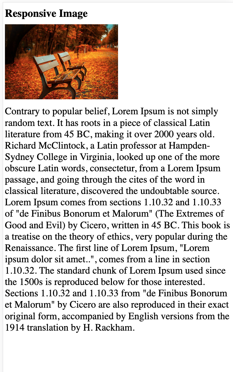
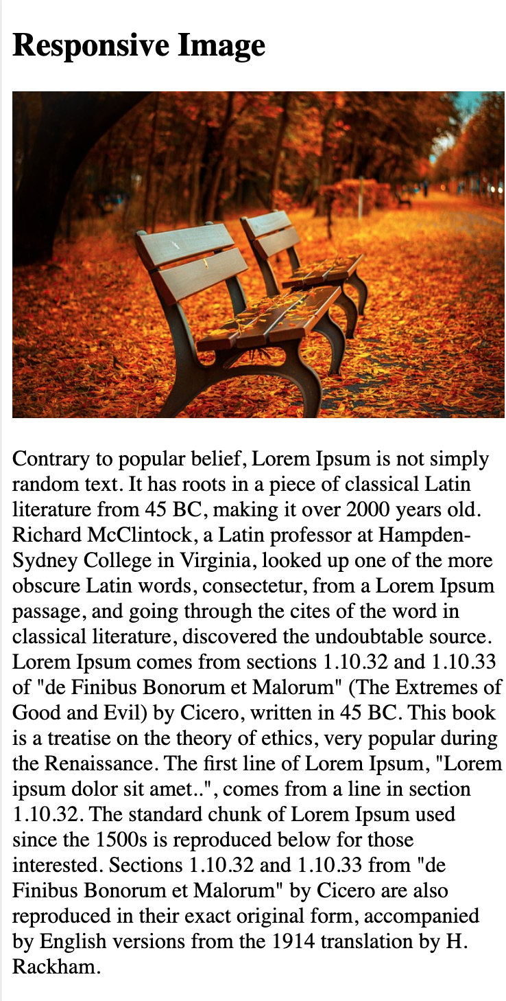
<h2>Responsive Image</h2>
<p>When you set the CSS width property using a percentage value, the image will adjust its size as you resize the browser window. Try resizing the browser window to observe the effect.</p>
<img src="/assets/files/cat.jpg" style="width:100%;">
</body>
</html>
<!DOCTYPE html>
<html>
  <head>
    <title>Page Title</title>
  </head>
  <body>
<p>Adjust the size of your browser, and the image will switch at 600 pixels and 1500 pixels.</p>
    <picture>
      <source srcset="/assets/files/bird.jpg" media="(max-width: 600px)">
      <source srcset="/assets/files/bird.jpg" media="(max-width: 1500px)">
      <source srcset="/assets/files/parrot.jpg">
      <img src="/assets/files/parrot.jpg" alt="Flowers">
    </picture>
  </body>
</html>
<!DOCTYPE html>
<html>
  <head>
    <title>Page Title</title>
  </head>
  <body>
<p>Adjust the size of your browser, and the image will switch at 600 pixels and 1500 pixels.</p>
    <picture>
      <source srcset="/assets/files/flower-1.jpg" media="(max-width: 600px)">
      <source srcset="/assets/files/flower-2.jpg" media="(max-width: 1500px)">
      <source srcset="/assets/files/flower-1.jpg">
      <img src="/assets/files/flower-2.jpg" alt="Flowers">
    </picture>
  </body>
</html>
<!DOCTYPE html>
<html>
  <head>
    <meta name="viewport" content="width=device-width, initial-scale=1.0">
  </head>
  <body>
    <h1 style="font-size:10vw;">Responsive Text</h1>
    <p style="font-size:5vw;"> Adjust the size of your browser window to observe how the text changes in size.</p>
    <p style="font-size:5vw;">Use the "vw" unit to determine the text size. Setting it to 10vw will make the text size equal to 10% of the width of the viewport.</p>
    <p>The viewport refers to the size of the browser window. When we say 1vw, it means 1% of the viewport width. For instance, if the viewport is 50cm wide, then 1vw would be equivalent to 0.5cm.</p>
  </body>
</html>
<!DOCTYPE html>
<html>
  <head>
    <meta name="viewport" content="width=device-width, initial-scale=1.0">
    <style>
      * {
        box-sizing: border-box;
      }

      .left {
        background-color: #2196F3;
        padding: 20px;
        float: left;
        width: 20%;
        /* The width is 20%, by default */
      }

      .main {
        background-color: #f1f1f1;
        padding: 20px;
        float: left;
        width: 60%;
        /* The width is 60%, by default */
      }

      .right {
        background-color: #04AA6D;
        padding: 20px;
        float: left;
        width: 20%;
        /* The width is 20%, by default */
      }

      /* Use a media query to add a break point at 800px: */
      @media screen and (max-width: 800px) {

        .left,
        .main,
        .right {
          width: 100%;
          /* The width is 100%, when the viewport is 800px or smaller */
        }
      }
    </style>
  </head>
  <body>
    <h2>Media Queries</h2>
    <p>Resize the browser window.</p>
    <p> Ensure that you hit the breakpoint at 800 pixels when adjusting the size of this frame.</p>
    <div class="left">
      <p>Left Menu</p>
    </div>
    <div class="main">
      <p>Main Content</p>
    </div>
    <div class="right">
      <p>Right Content</p>
    </div>
  </body>
</html>
<!DOCTYPE html>
<html>
  <head>
    <title>PPT.CSS</title>
    <meta name="viewport" content="width=device-width, initial-scale=1">
    <style>
      .ppt-container.ppt-green {
        color: #fff !important;
        background-color: rgb(0 151 167) !important;
        padding: 5px;
      }

      .ppt-row-padding {
        display: flex;
        gap: 10px;
        flex-wrap: wrap;
      }

      .ppt-third {
        max-width: 300px;
      }
    </style>
  </head>
  <body>
    <div class="ppt-container ppt-green">
      <h1>Propertutorials Demo</h1>
      <p>Resize this responsive page!</p>
    </div>
    <div class="ppt-row-padding">
      <div class="ppt-third">
        <h2>London</h2>
        <p>London is the capital city of England.</p>
        <p>London has the highest population among all cities in the United Kingdom, and it is home to more than 13 million people in its metropolitan area.</p>
      </div>
      <div class="ppt-third">
        <h2>Paris</h2>
        <p>Paris is the capital of France.</p>
        <p>The Paris region has over 12 million people, making it one of the most densely populated areas in Europe.</p>
      </div>
      <div class="ppt-third">
        <h2>Tokyo</h2>
        <p>Tokyo is the capital of Japan.</p>
        <p>It's at the heart of the Greater Tokyo Area, and it's the most densely populated metropolitan region globally.</p>
      </div>
    </div>
  </body>
</html>
<!DOCTYPE html>
<html lang="en">
  <head>
    <title>Bootstrap 5 Example</title>
    <meta charset="utf-8">
    <meta name="viewport" content="width=device-width, initial-scale=1">
    <link href="https://cdn.jsdelivr.net/npm/bootstrap@5.2.3/dist/css/bootstrap.min.css" rel="stylesheet">
    <script src="https://cdn.jsdelivr.net/npm/bootstrap@5.2.3/dist/js/bootstrap.bundle.min.js"></script>
  </head>
  <body>
    <div class="container-fluid p-5 bg-primary text-white text-center">
      <h1>My First Bootstrap Page</h1>
      <p>Resize this responsive page to see the effect!</p>
    </div>
    <div class="container mt-5">
      <div class="row">
        <div class="col-sm-4">
          <h3>Column 1</h3>
          <p>Lorem ipsum dolor sit amet, consectetur adipisicing elit...</p>
          <p>Ut enim ad minim veniam, quis nostrud exercitation ullamco laboris...</p>
        </div>
        <div class="col-sm-4">
          <h3>Column 2</h3>
          <p>Lorem ipsum dolor sit amet, consectetur adipisicing elit...</p>
          <p>Ut enim ad minim veniam, quis nostrud exercitation ullamco laboris...</p>
        </div>
        <div class="col-sm-4">
          <h3>Column 3</h3>
          <p>Lorem ipsum dolor sit amet, consectetur adipisicing elit...</p>
          <p>Ut enim ad minim veniam, quis nostrud exercitation ullamco laboris...</p>
        </div>
      </div>
    </div>
  </body>
</html>


 HTML
HTML
 CSS
CSS
 Javascript
 Jquery