CSS Float
The CSS property called float tells an element how to float on a webpage.
The CSS property called clear decides which elements can be next to the cleared element and on which side.
The float Property
The float property helps you position and format things on a web page. For example, it can make an image move to the left side of some text inside a box.
The float property can be set to one of these options:
-
left - The item moves to the left side of its box.
-
right - The item moves to the right side of the box it's in.
-
none - The item doesn't move around (it stays in its original place in the text). This is how it normally behaves.
-
inherit -The element takes on the same floating style as its parent.
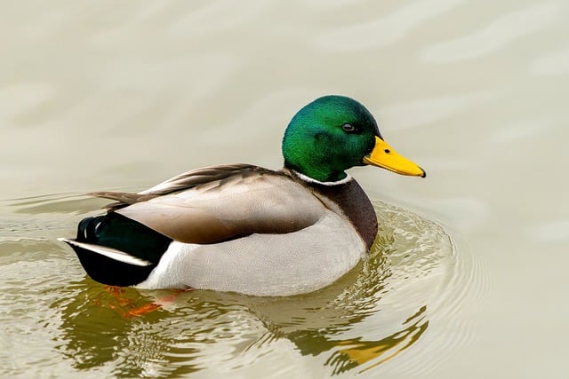
Example - float: right;
In this example, it's defined that an image should appear on the right side within a block of text.
 Lorem ipsum dolor sit amet, consectetur adipiscing elit. Phasellus imperdiet, nulla et dictum interdum, nisi lorem egestas odio, vitae scelerisque enim ligula venenatis dolor. Maecenas nisl est, ultrices nec congue eget, auctor vitae massa. Fusce luctus vestibulum augue ut aliquet. Mauris ante ligula, facilisis sed ornare eu, lobortis in odio. Praesent convallis urna a lacus interdum ut hendrerit risus congue. Nunc sagittis dictum nisi, sed ullamcorper ipsum dignissim ac...
Example - float: left;
In this example, we indicate that an image should be positioned to the left within a block of text.
Lorem ipsum dolor sit amet, consectetur adipiscing elit. Phasellus imperdiet, nulla et dictum interdum, nisi lorem egestas odio, vitae scelerisque enim ligula venenatis dolor. Maecenas nisl est, ultrices nec congue eget, auctor vitae massa. Fusce luctus vestibulum augue ut aliquet. Mauris ante ligula, facilisis sed ornare eu, lobortis in odio. Praesent convallis urna a lacus interdum ut hendrerit risus congue. Nunc sagittis dictum nisi, sed ullamcorper ipsum dignissim ac...
Example - No float
In this example, the image will appear exactly where it's placed in the text without any special alignment (using "float: none;").
Lorem ipsum dolor sit amet, consectetur adipiscing elit. Phasellus imperdiet, nulla et dictum interdum, nisi lorem egestas odio, vitae scelerisque enim ligula venenatis dolor. Maecenas nisl est, ultrices nec congue eget, auctor vitae massa. Fusce luctus vestibulum augue ut aliquet. Mauris ante ligula, facilisis sed ornare eu, lobortis in odio. Praesent convallis urna a lacus interdum ut hendrerit risus congue. Nunc sagittis dictum nisi, sed ullamcorper ipsum dignissim ac...
Example - Float Next To Each Other
Normally div elements will be displayed on top of each other. However, if we
use float: left we can let elements float next to each other:
Example
div {
float: left;
padding: 15px;
}
.div1 {
background: red;
}
.div2 {
background: yellow;
}
.div3 {
background: green;
}
Try it Yourself »
CSS Layout - clear and clearfix
The clear Property
When we apply the float property, and we want the next element to be positioned below it (not on the right or left), we need to use the clear property.
The clear property tells us what should occur with an element that is positioned next to another element that is floating.
The clear property can be set to one of these options:
-
none - The element stays in its position even when there are elements floated to the left or right. This is the default behavior.
-
left -
The element is moved underneath the left-aligned elements.
-
right - The element is moved down below the elements that are floating to the right.
-
both - The item is moved down beneath elements that float to the left and the right.
-
inherit - The element gets its 'clear' value from its parent.
When you want to stop elements from floating next to each other, you should make sure the clearing direction matches the floating direction. For example, if an element is floated to the left, you should clear it to the left as well. This way, the floated element will stay where it is, but the cleared element will show up below it on the webpage.
The clearfix Hack
When a floated item is taller than its containing element, it sticks out beyond the container's boundaries. To fix this issue, we can apply a clearfix hack.
The overflow: auto trick is good if you can manage your margins and padding properly (or else you might get scrollbars). But there's a better and safer way to clear content called the new, modern clearfix technique. Most webpages use the following code for it:
Example
.clearfix::after {
content: "";
clear: both;
display: table;
}
Try it Yourself »
<!DOCTYPE html>
<html>
  <head>
    <style>
      img {
        float: right;
      }
    </style>
  </head>
  <body>
    <h2>Float Right</h2>
    <p>In this instance, the picture will be positioned to the right within the paragraph, causing the text in the paragraph to flow around the image.</p>
    <p>
      <img src="/assets/files/duck.jpg" alt="Duck" style="width:170px;height:170px;margin-left:15px;"> Lorem ipsum dolor sit amet, consectetur adipiscing elit. Phasellus imperdiet, nulla et dictum interdum, nisi lorem egestas odio, vitae scelerisque enim ligula venenatis dolor. Maecenas nisl est, ultrices nec congue eget, auctor vitae massa. Fusce luctus vestibulum augue ut aliquet. Mauris ante ligula, facilisis sed ornare eu, lobortis in odio. Praesent convallis urna a lacus interdum ut hendrerit risus congue. Nunc sagittis dictum nisi, sed ullamcorper ipsum dignissim ac. In at libero sed nunc venenatis imperdiet sed ornare turpis. Donec vitae dui eget tellus gravida venenatis. Integer fringilla congue eros non fermentum. Sed dapibus pulvinar nibh tempor porta. Cras ac leo purus. Mauris quis diam velit.
    </p>
  </body>
</html>
<!DOCTYPE html>
<html>
  <head>
    <style>
      img {
        float: left;
      }
    </style>
  </head>
  <body>
    <h2>Float Left</h2>
    <p>In this instance, the picture will be positioned to the left within the paragraph, causing the text in the paragraph to encircle the image.</p>
    <p>
      <img src="/assets/files/duck.jpg" alt="Duck" style="width:170px;height:170px;margin-right:15px;"> Lorem ipsum dolor sit amet, consectetur adipiscing elit. Phasellus imperdiet, nulla et dictum interdum, nisi lorem egestas odio, vitae scelerisque enim ligula venenatis dolor. Maecenas nisl est, ultrices nec congue eget, auctor vitae massa. Fusce luctus vestibulum augue ut aliquet. Mauris ante ligula, facilisis sed ornare eu, lobortis in odio. Praesent convallis urna a lacus interdum ut hendrerit risus congue. Nunc sagittis dictum nisi, sed ullamcorper ipsum dignissim ac. In at libero sed nunc venenatis imperdiet sed ornare turpis. Donec vitae dui eget tellus gravida venenatis. Integer fringilla congue eros non fermentum. Sed dapibus pulvinar nibh tempor porta. Cras ac leo purus. Mauris quis diam velit.
    </p>
  </body>
</html>
<!DOCTYPE html>
<html>
  <head>
    <style>
      img {
        float: none;
      }
    </style>
  </head>
  <body>
    <h2>Float None</h2>
    <p>In this instance, the picture will appear exactly where it is positioned in the text without any alignment (float: none;).</p>
    <p>
      <img src="/assets/files/duck.jpg" alt="Duck" style="width:170px;height:170px;"> Lorem ipsum dolor sit amet, consectetur adipiscing elit. Phasellus imperdiet, nulla et dictum interdum, nisi lorem egestas odio, vitae scelerisque enim ligula venenatis dolor. Maecenas nisl est, ultrices nec congue eget, auctor vitae massa. Fusce luctus vestibulum augue ut aliquet. Mauris ante ligula, facilisis sed ornare eu, lobortis in odio. Praesent convallis urna a lacus interdum ut hendrerit risus congue. Nunc sagittis dictum nisi, sed ullamcorper ipsum dignissim ac. In at libero sed nunc venenatis imperdiet sed ornare turpis. Donec vitae dui eget tellus gravida venenatis. Integer fringilla congue eros non fermentum. Sed dapibus pulvinar nibh tempor porta. Cras ac leo purus. Mauris quis diam velit.
    </p>
  </body>
</html>
<!DOCTYPE html>
<html>
  <head>
    <style>
      div {
        float: left;
        padding: 15px;
      }

      .div1 {
        background: red;
      }

      .div2 {
        background: yellow;
      }

      .div3 {
        background: green;
      }
    </style>
  </head>
  <body>
    <h2>Float Next To Each Other</h2>
    <p>In this example, the three divs will float next to each other.</p>
    <div class="div1">Div 1</div>
    <div class="div2">Div 2</div>
    <div class="div3">Div 3</div>
  </body>
</html>
<!DOCTYPE html>
<html>
  <head>
    <style>
      .div1 {
        float: left;
        padding: 10px;
        border: 3px solid #73AD21;
      }

      .div2 {
        padding: 10px;
        border: 3px solid red;
      }

      .div3 {
        float: left;
        padding: 10px;
        border: 3px solid #73AD21;
      }

      .div4 {
        padding: 10px;
        border: 3px solid red;
        clear: left;
      }
    </style>
  </head>
  <body>
    <h2>Without clear</h2>
    <div class="div1">div1</div>
    <div class="div2">div2 - Notice that div2 is after div1 in the HTML code. However, since div1 floats to the left, the text in div2 flows around div1.</div>
    <br>
    <br>
    <h2>With clear</h2>
    <div class="div3">div3</div>
    <div class="div4">div4 - Here, clear: left; moves div4 down below the floating div3. The value "left" clears elements floated to the left. You can also clear "right" and "both".</div>
  </body>
</html>
<!DOCTYPE html>
<html>
  <head>
    <style>
      div {
        border: 3px solid #4CAF50;
        padding: 5px;
      }

      .img1 {
        float: right;
      }

      .img2 {
        float: right;
      }

      .clearfix {
        overflow: auto;
      }
    </style>
  </head>
  <body>
    <h2>Without Clearfix</h2>
    <p>This picture is positioned to the right. It is also taller than the surrounding element, causing it to extend beyond its container.</p>
    <div>
      <img class="img1" src="/assets/files/duck.jpg" alt="Duck" width="170" height="170"> Lorem ipsum dolor sit amet, consectetur adipiscing elit. Phasellus imperdiet...
    </div>
    <h2 style="clear:right">With Clearfix</h2>
    <p>To solve this issue, you can include a clearfix class in the parent element and set its overflow property to auto.</p>
    <div class="clearfix">
      <img class="img2" src="/assets/files/duck.jpg" alt="Duck" width="170" height="170"> Lorem ipsum dolor sit amet, consectetur adipiscing elit. Phasellus imperdiet...
    </div>
  </body>
</html>
<!DOCTYPE html>
<html>
  <head>
    <style>
      div {
        border: 3px solid #4CAF50;
        padding: 5px;
      }

      .img1 {
        float: right;
      }

      .img2 {
        float: right;
      }

      .clearfix::after {
        content: "";
        clear: both;
        display: table;
      }
    </style>
  </head>
  <body>
    <h2>Without Clearfix</h2>
    <p>This picture is positioned to the right. Additionally, it is taller than the surrounding element, causing it to extend beyond its container:</p>
    <div>
      <img class="img1" src="/assets/files/duck.jpg" alt="Duck" width="170" height="170"> Lorem ipsum dolor sit amet, consectetur adipiscing elit. Phasellus imperdiet...
    </div>
    <h2 style="clear:right">With New Modern Clearfix</h2>
    <p>Apply the clearfix hack to the enclosing element to resolve this issue.</p>
    <div class="clearfix">
      <img class="img2" src="/assets/files/duck.jpg" alt="Duck" width="170" height="170"> Lorem ipsum dolor sit amet, consectetur adipiscing elit. Phasellus imperdiet...
    </div>
  </body>
</html>
 HTML
HTML
 CSS
CSS
 Javascript
 Jquery