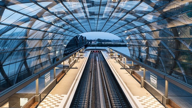
Resize the browser window to see how the image scales to fit the page.
Using The width Property
If you set the width to a percentage and the height to 'auto' for an image, it will adjust its size to fit the screen and can be scaled both larger and smaller.
In the example above, you can make the picture bigger than its original size. However, in many situations, it's smarter to use the "max-width" property instead of doing that.
Using The max-width Property
When the 'max-width' property is set to 100%, an image can shrink in size if necessary, but it will never enlarge beyond its original dimensions.
Add an Image to The Example Web Page
Background Images
Background images can adapt and change when you resize and adjust them.
In this article, we'll explain three distinct approaches:
1. When you set the background-size property to "contain," the background image will resize itself to try and fit the content area. But it will still maintain its original proportions, meaning the width and height ratio of the image remains the same:
Here's the CSS code:
2. When you set the background-size property to "100% 100%", the background image will expand to fit the entire content area:
This is the CSS code:
3. When you set the background-size property to "cover," the background image will stretch to cover the whole content area. However, it retains its original proportions, so some of the image might be hidden:
This is the CSS code:
Different Images for Different Devices
If you put a huge picture on a large computer screen, that's great. But it's not so great on a small device. Why make the device load a big image and then make it smaller? To save loading time and for other reasons, you can use media queries to show different pictures on different devices.
There's a big picture and a small picture that will show up on various devices:
If you want to make sure an image stays the same when you resize the browser window, use min-device-width in your media query instead of min-width. This way, it checks the width of the device, not just the browser:
The HTML <picture> Element
The HTML <picture> element provides greater flexibility for web developers when defining image resources.
The <picture> element is typically used for pictures in responsive designs. Instead of using a single image that gets bigger or smaller depending on the screen size, you can use several images to better fit the size of the web browser window.
The <picture> element operates like the <video> and elements. You provide various sources, and the element selects the first source that matches the requirements:
You need the "srcset" attribute, which tells where the image comes from.
The "media" part is not a must-have, and it can take the media queries you see in the CSS "@media rule" found at this link: CSS @media rule.
You should also create an element with specified width and height for browsers that cannot display the element.
<!DOCTYPE html>
<html>
  <head>
    <meta name="viewport" content="width=device-width, initial-scale=1.0">
    <style>
      img {
        max-width: 100%;
        height: auto;
      }
    </style>
  </head>
  <body>
    <img src="/assets/files/train.jpg" width="460" height="345">
    <p>Adjust the size of your browser window to see how the picture changes when the width is smaller than 460 pixels.</p>
  </body>
</html>
<!DOCTYPE html>
<html>
  <head>
    <meta name="viewport" content="width=device-width, initial-scale=1.0">
    <style>
      * {
        box-sizing: border-box;
      }

      img {
        width: 100%;
        height: auto;
      }

      .row:after {
        content: "";
        clear: both;
        display: table;
      }

      [class*="col-"] {
        float: left;
        padding: 15px;
        width: 100%;
      }

      @media only screen and (min-width: 600px) {
        .col-s-1 {
          width: 8.33%;
        }

        .col-s-2 {
          width: 16.66%;
        }

        .col-s-3 {
          width: 25%;
        }

        .col-s-4 {
          width: 33.33%;
        }

        .col-s-5 {
          width: 41.66%;
        }

        .col-s-6 {
          width: 50%;
        }

        .col-s-7 {
          width: 58.33%;
        }

        .col-s-8 {
          width: 66.66%;
        }

        .col-s-9 {
          width: 75%;
        }

        .col-s-10 {
          width: 83.33%;
        }

        .col-s-11 {
          width: 91.66%;
        }

        .col-s-12 {
          width: 100%;
        }
      }

      @media only screen and (min-width: 768px) {
        .col-1 {
          width: 8.33%;
        }

        .col-2 {
          width: 16.66%;
        }

        .col-3 {
          width: 25%;
        }

        .col-4 {
          width: 33.33%;
        }

        .col-5 {
          width: 41.66%;
        }

        .col-6 {
          width: 50%;
        }

        .col-7 {
          width: 58.33%;
        }

        .col-8 {
          width: 66.66%;
        }

        .col-9 {
          width: 75%;
        }

        .col-10 {
          width: 83.33%;
        }

        .col-11 {
          width: 91.66%;
        }

        .col-12 {
          width: 100%;
        }
      }

      html {
        font-family: "Lucida Sans", sans-serif;
      }

      .header {
        background-color: #9933cc;
        color: #ffffff;
        padding: 15px;
      }

      .menu ul {
        list-style-type: none;
        margin: 0;
        padding: 0;
      }

      .menu li {
        padding: 8px;
        margin-bottom: 7px;
        background-color: #33b5e5;
        color: #ffffff;
        box-shadow: 0 1px 3px rgba(0, 0, 0, 0.12), 0 1px 2px rgba(0, 0, 0, 0.24);
      }

      .menu li:hover {
        background-color: #0099cc;
      }

      .aside {
        background-color: #33b5e5;
        padding: 15px;
        color: #ffffff;
        text-align: center;
        font-size: 14px;
        box-shadow: 0 1px 3px rgba(0, 0, 0, 0.12), 0 1px 2px rgba(0, 0, 0, 0.24);
      }

      .footer {
        background-color: #0099cc;
        color: #ffffff;
        text-align: center;
        font-size: 12px;
        padding: 15px;
      }
    </style>
  </head>
  <body>
    <div class="header">
      <h1>Chania</h1>
    </div>
    <div class="row">
      <div class="col-3 col-s-3 menu">
        <ul>
          <li>The Flight</li>
          <li>The City</li>
          <li>The Island</li>
          <li>The Food</li>
        </ul>
      </div>
      <div class="col-6 col-s-9">
        <h1>The City</h1>
        <p>Lorem Ipsum is simply dummy text of the printing and typesetting industry. Lorem Ipsum has been the industry's standard dummy text ever since the 1500s.</p>
        <img src="/assets/files/train.jpg" width="460" height="345">
      </div>
      <div class="col-3 col-s-12">
        <div class="aside">
          <h2>What?</h2>
          <p>Chania is a city on the island of Crete.</p>
          <h2>Where?</h2>
          <p>Crete is a Greek island in the Mediterranean Sea.</p>
          <h2>How?</h2>
          <p>You can reach Chania airport from all over Europe.</p>
        </div>
      </div>
    </div>
    <div class="footer">
      <p>Adjust the size of your browser window to see how the content changes when you make it bigger or smaller.</p>
    </div>
  </body>
</html>
<!DOCTYPE html>
<html>
  <head>
    <meta name="viewport" content="width=device-width, initial-scale=1.0">
    <style>
      div {
        width: 100%;
        height: 400px;
        background-image: url('/assets/files/train.jpg');
        background-repeat: no-repeat;
        background-size: contain;
        border: 1px solid red;
      }
    </style>
  </head>
  <body>
    <p>Resize the browser window to see the effect.</p>
    <div></div>
  </body>
</html>
<!DOCTYPE html>
<html>
  <head>
    <meta name="viewport" content="width=device-width, initial-scale=1.0">
    <style>
      div {
        width: 100%;
        height: 400px;
        background-image: url('/assets/files/train.jpg');
        background-size: 100% 100%;
        border: 1px solid red;
      }
    </style>
  </head>
  <body>
    <p>Resize the browser window to see the effect.</p>
    <div></div>
  </body>
</html>
<!DOCTYPE html>
<html>
  <head>
    <meta name="viewport" content="width=device-width, initial-scale=1.0">
    <style>
      div {
        width: 100%;
        height: 400px;
        background-image: url('/assets/files/train.jpg');
        background-size: cover;
        border: 1px solid red;
      }
    </style>
  </head>
  <body>
    <p>Resize the browser window to see the effect.</p>
    <div></div>
  </body>
</html>
<!DOCTYPE html>
<html>
  <head>
    <meta name="viewport" content="width=device-width, initial-scale=1.0">
    <style>
      /* For width smaller than 400px: */
      body {
        background-repeat: no-repeat;
        background-image: url('/assets/files/alps.jpg');
      }

      /* For width 400px and larger: */
      @media only screen and (min-width: 400px) {
        body {
          background-image: url('/assets/files/envelope.jpg');
        }
      }
    </style>
  </head>
  <body>
    <p style="margin-top:360px;">Resize the browser width and the background image will change at 400px.</p>
  </body>
</html>
<!DOCTYPE html>
<html>
  <head>
    <meta name="viewport" content="width=device-width, initial-scale=1.0">
    <style>
      /* For device width smaller than 400px: */
      body {
        background-repeat: no-repeat;
        background-image: url('/assets/files/alps.jpg');
      }

      /* For device width 400px and larger: */
      @media only screen and (min-device-width: 400px) {
        body {
          background-image: url('/assets/files/alps.jpg');
        }
      }
    </style>
  </head>
  <body></body>
</html>
<!DOCTYPE html>
<html>
  <head>
    <meta name="viewport" content="width=device-width, initial-scale=1.0">
  </head>
  <body>
    <picture>
      <source srcset="/assets/files/envelope.jpg" media="(max-width: 400px)">
      <source srcset="/assets/files/alps.jpg">
      <img src="img_flowers.jpg" alt="Flowers" style="width:auto;">
    </picture>
    <p>Resize the browser width and the background image will change at 400px.</p>
  </body>
</html>

 HTML
HTML
 CSS
CSS
 Javascript
 Jquery