Header
Menu
Main
Right
Footer
Grid Layout
The CSS Grid Layout Module provides a way to arrange web page elements in a grid, using rows and columns. It simplifies webpage design by eliminating the need for using floats and positioning.
Grid Elements
A grid layout is made up of a main container, and inside it, there are some smaller elements.
Display Property
An HTML element turns into a grid container if you set its display property to either grid or inline-grid.
All the immediate children of the grid container automatically turn into grid items.
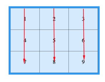
Grid Columns
The up-and-down lines in grid items are named columns.
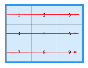
Grid Rows
The lines that go side to side in a grid are called rows.
Grid Gaps
The empty spaces separating columns or rows are referred to as gaps.
You can change the space between things by using one of these options:
Grid Lines
The lines that separate columns are named column lines.
The lines that separate rows are known as row lines.
When you're putting something in a grid container, use the line numbers as a reference.
All CSS Grid Properties
| Property |
Description |
| column-gap |
Describes the space between the columns. |
| gap |
A short way to describe both the gap between rows and the gap between columns in HTML using the row-gap and column-gap properties. |
| grid |
A shorter way to set the grid-template-rows, grid-template-columns, grid-template-areas, grid-auto-rows, grid-auto-columns, and the grid-auto-flow properties all at once. |
| grid-area |
You can use this property to give a name to a grid item. Alternatively, it acts as a shortcut for the properties grid-row-start, grid-column-start, grid-row-end, and grid-column-end. |
| grid-auto-columns |
Sets the standard width for columns. |
| grid-auto-flow |
Describes where automatically arranged items go on the grid. |
| grid-auto-rows |
Describes the standard height of a row. |
| grid-column |
A shorter way to describe the grid-column-start and grid-column-end properties. |
| grid-column-end |
Indicates the stopping point for the grid item. |
| grid-column-gap |
Describes how much space there is between columns. |
| grid-column-start |
This tells us where to begin the grid item. |
| grid-gap |
A shorter way to describe the gap between rows and columns in a grid. |
| grid-row |
A convenient way to set the starting and ending positions of rows in a grid layout. |
| grid-row-end |
This tells us where the grid item should stop. |
| grid-row-gap |
Describes the width of the space between rows. |
| grid-row-start |
Indicates the position to begin the grid item. |
| grid-template |
A shorter way to set the grid-template-rows, grid-template-columns, and grid-areas properties using a single property. |
| grid-template-areas |
Describes how to show columns and rows with named grid items. |
| grid-template-columns |
This tells us how big the columns are and how many columns there are in a grid layout. |
| grid-template-rows |
This sets the height of the rows in a grid layout. |
| row-gap |
Describes the space between the rows in a grid. |
<!DOCTYPE html>
<html>
  <head>
    <style>
      .grid-container {
        display: grid;
        grid-template-columns: auto auto auto;
        background-color: #2196F3;
        padding: 10px;
      }

      .grid-item {
        background-color: rgba(255, 255, 255, 0.8);
        border: 1px solid rgba(0, 0, 0, 0.8);
        padding: 20px;
        font-size: 30px;
        text-align: center;
      }
    </style>
  </head>
  <body>
    <h1>Grid Elements</h1>
    <p>A Grid Layout needs a main element where the display property is set to grid or inline-grid.</p>
    <p>The things directly inside the grid box automatically become parts of the grid.</p>
    <div class="grid-container">
      <div class="grid-item">1</div>
      <div class="grid-item">2</div>
      <div class="grid-item">3</div>
      <div class="grid-item">4</div>
      <div class="grid-item">5</div>
      <div class="grid-item">6</div>
      <div class="grid-item">7</div>
      <div class="grid-item">8</div>
      <div class="grid-item">9</div>
    </div>
  </body>
</html>
<!DOCTYPE html>
<html>
  <head>
    <style>
      .grid-container {
        display: grid;
        grid-template-columns: auto auto auto;
        background-color: #2196F3;
        padding: 10px;
      }

      .grid-item {
        background-color: rgba(255, 255, 255, 0.8);
        border: 1px solid rgba(0, 0, 0, 0.8);
        padding: 20px;
        font-size: 30px;
        text-align: center;
      }
    </style>
  </head>
  <body>
    <h1>display: grid</h1>
    <p>Use display: grid; to make a block-level grid container:</p>
    <div class="grid-container">
      <div class="grid-item">1</div>
      <div class="grid-item">2</div>
      <div class="grid-item">3</div>
      <div class="grid-item">4</div>
      <div class="grid-item">5</div>
      <div class="grid-item">6</div>
      <div class="grid-item">7</div>
      <div class="grid-item">8</div>
      <div class="grid-item">9</div>
    </div>
  </body>
</html>
<!DOCTYPE html>
<html>
  <head>
    <style>
      .grid-container {
        display: inline-grid;
        grid-template-columns: auto auto auto;
        background-color: #2196F3;
        padding: 10px;
      }

      .grid-item {
        background-color: rgba(255, 255, 255, 0.8);
        border: 1px solid rgba(0, 0, 0, 0.8);
        padding: 20px;
        font-size: 30px;
        text-align: center;
      }
    </style>
  </head>
  <body>
    <h1>display: inline-grid</h1>
    <p>Use display: inline-grid; to make an inline grid container:</p>
    <div class="grid-container">
      <div class="grid-item">1</div>
      <div class="grid-item">2</div>
      <div class="grid-item">3</div>
      <div class="grid-item">4</div>
      <div class="grid-item">5</div>
      <div class="grid-item">6</div>
      <div class="grid-item">7</div>
      <div class="grid-item">8</div>
      <div class="grid-item">9</div>
    </div>
  </body>
</html>
<!DOCTYPE html>
<html>
  <head>
    <style>
      .grid-container {
        display: grid;
        column-gap: 50px;
        grid-template-columns: auto auto auto;
        background-color: #2196F3;
        padding: 10px;
      }

      .grid-item {
        background-color: rgba(255, 255, 255, 0.8);
        border: 1px solid rgba(0, 0, 0, 0.8);
        padding: 20px;
        font-size: 30px;
        text-align: center;
      }
    </style>
  </head>
  <body>
    <h1>The column-gap Property</h1>
    <p>Use the <em>column-gap</em> property to change the gap between columns. </p>
    <div class="grid-container">
      <div class="grid-item">1</div>
      <div class="grid-item">2</div>
      <div class="grid-item">3</div>
      <div class="grid-item">4</div>
      <div class="grid-item">5</div>
      <div class="grid-item">6</div>
      <div class="grid-item">7</div>
      <div class="grid-item">8</div>
      <div class="grid-item">9</div>
    </div>
  </body>
</html>
<!DOCTYPE html>
<html>
  <head>
    <style>
      .grid-container {
        display: grid;
        row-gap: 50px;
        grid-template-columns: auto auto auto;
        background-color: #2196F3;
        padding: 10px;
      }

      .grid-item {
        background-color: rgba(255, 255, 255, 0.8);
        border: 1px solid rgba(0, 0, 0, 0.8);
        padding: 20px;
        font-size: 30px;
        text-align: center;
      }
    </style>
  </head>
  <body>
    <h1>The row-gap Property</h1>
    <p>Use the <em>row-gap</em> attribute to change the gap between the rows: </p>
    <div class="grid-container">
      <div class="grid-item">1</div>
      <div class="grid-item">2</div>
      <div class="grid-item">3</div>
      <div class="grid-item">4</div>
      <div class="grid-item">5</div>
      <div class="grid-item">6</div>
      <div class="grid-item">7</div>
      <div class="grid-item">8</div>
      <div class="grid-item">9</div>
    </div>
  </body>
</html>
<!DOCTYPE html>
<html>
  <head>
    <style>
      .grid-container {
        display: grid;
        gap: 50px 100px;
        grid-template-columns: auto auto auto;
        background-color: #2196F3;
        padding: 10px;
      }

      .grid-item {
        background-color: rgba(255, 255, 255, 0.8);
        border: 1px solid rgba(0, 0, 0, 0.8);
        padding: 20px;
        font-size: 30px;
        text-align: center;
      }
    </style>
  </head>
  <body>
    <h1>The gap Property</h1>
    <p>Use the gap shorthand property to change the space between the columns and rows.</p>
    <div class="grid-container">
      <div class="grid-item">1</div>
      <div class="grid-item">2</div>
      <div class="grid-item">3</div>
      <div class="grid-item">4</div>
      <div class="grid-item">5</div>
      <div class="grid-item">6</div>
      <div class="grid-item">7</div>
      <div class="grid-item">8</div>
      <div class="grid-item">9</div>
    </div>
  </body>
</html>
<!DOCTYPE html>
<html>
  <head>
    <style>
      .grid-container {
        display: grid;
        gap: 50px;
        grid-template-columns: auto auto auto;
        background-color: #2196F3;
        padding: 10px;
      }

      .grid-item {
        background-color: rgba(255, 255, 255, 0.8);
        border: 1px solid rgba(0, 0, 0, 0.8);
        padding: 20px;
        font-size: 30px;
        text-align: center;
      }
    </style>
  </head>
  <body>
    <h1>The gap Property:</h1>
    <p>Use the <em>gap</em> shortcut to change the distance between columns and rows: </p>
    <div class="grid-container">
      <div class="grid-item">1</div>
      <div class="grid-item">2</div>
      <div class="grid-item">3</div>
      <div class="grid-item">4</div>
      <div class="grid-item">5</div>
      <div class="grid-item">6</div>
      <div class="grid-item">7</div>
      <div class="grid-item">8</div>
      <div class="grid-item">9</div>
    </div>
  </body>
</html>
<!DOCTYPE html>
<html>
  <head>
    <style>
      .grid-container {
        display: grid;
        grid-template-columns: auto auto auto;
        gap: 10px;
        background-color: #2196F3;
        padding: 10px;
      }

      .grid-container>div {
        background-color: rgba(255, 255, 255, 0.8);
        text-align: center;
        padding: 20px 0;
        font-size: 30px;
      }

      .item1 {
        grid-column-start: 1;
        grid-column-end: 3;
      }
    </style>
  </head>
  <body>
    <h1>Grid Lines</h1>
    <div class="grid-container">
      <div class="item1">1</div>
      <div class="item2">2</div>
      <div class="item3">3</div>
      <div class="item4">4</div>
      <div class="item5">5</div>
      <div class="item6">6</div>
      <div class="item7">7</div>
      <div class="item8">8</div>
    </div>
    <p>You can refer to line numbers when placing grid items.</p>
  </body>
</html>
<!DOCTYPE html>
<html>
  <head>
    <style>
      .grid-container {
        display: grid;
        grid-template-columns: auto auto auto;
        gap: 10px;
        background-color: #2196F3;
        padding: 10px;
      }

      .grid-container>div {
        background-color: rgba(255, 255, 255, 0.8);
        text-align: center;
        padding: 20px 0;
        font-size: 30px;
      }

      .item1 {
        grid-row-start: 1;
        grid-row-end: 3;
      }
    </style>
  </head>
  <body>
    <h1>Grid Lines</h1>
    <div class="grid-container">
      <div class="item1">1</div>
      <div class="item2">2</div>
      <div class="item3">3</div>
      <div class="item4">4</div>
      <div class="item5">5</div>
      <div class="item6">6</div>
      <div class="item7">7</div>
      <div class="item8">8</div>
    </div>
    <p>You can refer to line numbers when placing grid items.</p>
  </body>
</html>
 HTML
HTML
 CSS
CSS
 Javascript
 Jquery