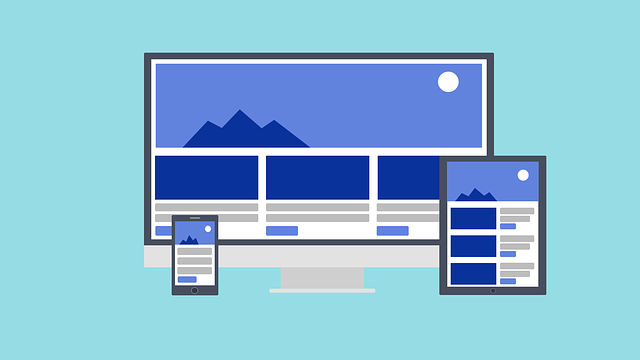
RWD Media Queries
What is a Media Query?
A media query is a special CSS method that was introduced in CSS3.
It employs the @media rule to add a set of CSS instructions when a specific condition is met.
Add a Breakpoint
In a previous part of this guide, we created a webpage with sections and columns. While it adapted to different screen sizes, it didn't appear well on smaller screens.
Media queries are useful for this. They allow us to set a point where specific parts of the design will change their behavior on each side of that point.

Apply a media query to set a breakpoint when the screen width reaches 768 pixels:
Always Design for Mobile First
Mobile First means creating a website for mobile devices first, before focusing on desktop or other gadgets. This approach helps the website load quickly on smaller screens.
This implies that we need to adjust our CSS code.
Instead of adjusting how things look when the screen is narrower than 768 pixels, we should make design changes when the screen is wider than 768 pixels. This approach prioritizes mobile devices.
Another Breakpoint
You can include as many breakpoints as you want.
We'll add a point where the design changes from tablets to mobile phones.
To achieve this, we include an additional media query at 600 pixels. We also introduce a new set of classes for devices that are larger than 600 pixels but smaller than 768 pixels.
It might seem strange to have two sets of the same classes, but this allows us to control how columns behave in HTML at different screen sizes.
Typical Device Breakpoints
There are many different screens and devices with various sizes, making it difficult to set specific points for each one. To simplify, you can focus on five groups:
Orientation: Portrait / Landscape
You can use media queries to adjust how a web page looks based on whether the browser is in a horizontal or vertical position.
You can use certain CSS styles that will work only when the width of the browser window is greater than its height. This is known as the "Landscape" orientation.
Hide Elements With Media Queries
Media queries are often used to hide things on various screen sizes.
Change Font Size With Media Queries
You can adjust the size of text in an element to fit different screen sizes by using media queries.
Variable Font Size.
<!DOCTYPE html>
<html>
  <head>
    <meta name="viewport" content="width=device-width, initial-scale=1.0">
    <style>
      body {
        background-color: lightgreen;
      }

      @media only screen and (max-width: 600px) {
        body {
          background-color: lightblue;
        }
      }
    </style>
  </head>
  <body>
    <p>Adjust the size of the browser window. If this document's width is 600 pixels or smaller, the background color becomes "lightblue"; otherwise, it's "lightgreen"</p>
  </body>
</html>
<!DOCTYPE html>
<html>
  <head>
    <meta name="viewport" content="width=device-width, initial-scale=1.0">
    <style>
      * {
        box-sizing: border-box;
      }

      .row::after {
        content: "";
        clear: both;
        display: block;
      }

      [class*="col-"] {
        float: left;
        padding: 15px;
      }

      html {
        font-family: "Lucida Sans", sans-serif;
      }

      .header {
        background-color: #9933cc;
        color: #ffffff;
        padding: 15px;
      }

      .menu ul {
        list-style-type: none;
        margin: 0;
        padding: 0;
      }

      .menu li {
        padding: 8px;
        margin-bottom: 7px;
        background-color: #33b5e5;
        color: #ffffff;
        box-shadow: 0 1px 3px rgba(0, 0, 0, 0.12), 0 1px 2px rgba(0, 0, 0, 0.24);
      }

      .menu li:hover {
        background-color: #0099cc;
      }

      .aside {
        background-color: #33b5e5;
        padding: 15px;
        color: #ffffff;
        text-align: center;
        font-size: 14px;
        box-shadow: 0 1px 3px rgba(0, 0, 0, 0.12), 0 1px 2px rgba(0, 0, 0, 0.24);
      }

      .footer {
        background-color: #0099cc;
        color: #ffffff;
        text-align: center;
        font-size: 12px;
        padding: 15px;
      }

      /* For desktop: */
      .col-1 {
        width: 8.33%;
      }

      .col-2 {
        width: 16.66%;
      }

      .col-3 {
        width: 25%;
      }

      .col-4 {
        width: 33.33%;
      }

      .col-5 {
        width: 41.66%;
      }

      .col-6 {
        width: 50%;
      }

      .col-7 {
        width: 58.33%;
      }

      .col-8 {
        width: 66.66%;
      }

      .col-9 {
        width: 75%;
      }

      .col-10 {
        width: 83.33%;
      }

      .col-11 {
        width: 91.66%;
      }

      .col-12 {
        width: 100%;
      }

      @media only screen and (max-width: 768px) {

        /* For mobile phones: */
        [class*="col-"] {
          width: 100%;
        }
      }
    </style>
  </head>
  <body>
    <div class="header">
      <h1>Chania</h1>
    </div>
    <div class="row">
      <div class="col-3 menu">
        <ul>
          <li>The Flight</li>
          <li>The City</li>
          <li>The Island</li>
          <li>The Food</li>
        </ul>
      </div>
      <div class="col-6">
        <h1>The City</h1>
        <p>Lorem Ipsum is simply dummy text of the printing and typesetting industry. Lorem Ipsum has been the industry's standard dummy text ever since the 1500s.</p>
      </div>
      <div class="col-3 right">
        <div class="aside">
          <h2>What?</h2>
          <p>when an unknown printer took a galley of type.</p>
          <h2>Where?</h2>
          <p>when an unknown printer took a galley of type.</p>
          <h2>How?</h2>
          <p>when an unknown printer took a galley of type.</p>
        </div>
      </div>
    </div>
    <div class="footer">
      <p>when an unknown printer took a galley of type.</p>
    </div>
  </body>
</html>
<!DOCTYPE html>
<html>
  <head>
    <meta name="viewport" content="width=device-width, initial-scale=1.0">
    <style>
      * {
        box-sizing: border-box;
      }

      .row::after {
        content: "";
        clear: both;
        display: table;
      }

      [class*="col-"] {
        float: left;
        padding: 15px;
      }

      html {
        font-family: "Lucida Sans", sans-serif;
      }

      .header {
        background-color: #9933cc;
        color: #ffffff;
        padding: 15px;
      }

      .menu ul {
        list-style-type: none;
        margin: 0;
        padding: 0;
      }

      .menu li {
        padding: 8px;
        margin-bottom: 7px;
        background-color: #33b5e5;
        color: #ffffff;
        box-shadow: 0 1px 3px rgba(0, 0, 0, 0.12), 0 1px 2px rgba(0, 0, 0, 0.24);
      }

      .menu li:hover {
        background-color: #0099cc;
      }

      .aside {
        background-color: #33b5e5;
        padding: 15px;
        color: #ffffff;
        text-align: center;
        font-size: 14px;
        box-shadow: 0 1px 3px rgba(0, 0, 0, 0.12), 0 1px 2px rgba(0, 0, 0, 0.24);
      }

      .footer {
        background-color: #0099cc;
        color: #ffffff;
        text-align: center;
        font-size: 12px;
        padding: 15px;
      }

      /* For mobile phones: */
      [class*="col-"] {
        width: 100%;
      }

      @media only screen and (min-width: 768px) {

        /* For desktop: */
        .col-1 {
          width: 8.33%;
        }

        .col-2 {
          width: 16.66%;
        }

        .col-3 {
          width: 25%;
        }

        .col-4 {
          width: 33.33%;
        }

        .col-5 {
          width: 41.66%;
        }

        .col-6 {
          width: 50%;
        }

        .col-7 {
          width: 58.33%;
        }

        .col-8 {
          width: 66.66%;
        }

        .col-9 {
          width: 75%;
        }

        .col-10 {
          width: 83.33%;
        }

        .col-11 {
          width: 91.66%;
        }

        .col-12 {
          width: 100%;
        }
      }
    </style>
  </head>
  <body>
    <div class="header">
      <h1>Chania</h1>
    </div>
    <div class="row">
      <div class="col-3 menu">
        <ul>
          <li>The Flight</li>
          <li>The City</li>
          <li>The Island</li>
          <li>The Food</li>
        </ul>
      </div>
      <div class="col-6">
        <h1>The City</h1>
        <p>Lorem Ipsum is simply dummy text of the printing and typesetting industry. Lorem Ipsum has been the industry's standard dummy text ever since the 1500s.</p>
      </div>
      <div class="col-3 right">
        <div class="aside">
          <h2>What?</h2>
          <p>Chania is a city on the island of Crete.</p>
          <h2>Where?</h2>
          <p>Crete is a Greek island in the Mediterranean Sea.</p>
          <h2>How?</h2>
          <p>You can reach Chania airport from all over Europe.</p>
        </div>
      </div>
    </div>
    <div class="footer">
      <p>Resize the browser window to see how the content respond to the resizing.</p>
    </div>
  </body>
</html>
<!DOCTYPE html>
<html>
<head>
<meta name="viewport" content="width=device-width, initial-scale=1.0">
<style>
* {
  box-sizing: border-box;
}

.row::after {
  content: "";
  clear: both;
  display: table;
}

[class*="col-"] {
  float: left;
  padding: 15px;
}

html {
  font-family: "Lucida Sans", sans-serif;
}

.header {
  background-color: #9933cc;
  color: #ffffff;
  padding: 15px;
}

.menu ul {
  list-style-type: none;
  margin: 0;
  padding: 0;
}

.menu li {
  padding: 8px;
  margin-bottom: 7px;
  background-color: #33b5e5;
  color: #ffffff;
  box-shadow: 0 1px 3px rgba(0,0,0,0.12), 0 1px 2px rgba(0,0,0,0.24);
}

.menu li:hover {
  background-color: #0099cc;
}

.aside {
  background-color: #33b5e5;
  padding: 15px;
  color: #ffffff;
  text-align: center;
  font-size: 14px;
  box-shadow: 0 1px 3px rgba(0,0,0,0.12), 0 1px 2px rgba(0,0,0,0.24);
}

.footer {
  background-color: #0099cc;
  color: #ffffff;
  text-align: center;
  font-size: 12px;
  padding: 15px;
}

/* For mobile phones: */
[class*="col-"] {
  width: 100%;
}

@media only screen and (min-width: 768px) {
  /* For desktop: */
  .col-1 {width: 8.33%;}
  .col-2 {width: 16.66%;}
  .col-3 {width: 25%;}
  .col-4 {width: 33.33%;}
  .col-5 {width: 41.66%;}
  .col-6 {width: 50%;}
  .col-7 {width: 58.33%;}
  .col-8 {width: 66.66%;}
  .col-9 {width: 75%;}
  .col-10 {width: 83.33%;}
  .col-11 {width: 91.66%;}
  .col-12 {width: 100%;}
}
</style>
</head>
<body>

<div class="header">
  <h1>Chania</h1>
</div>

<div class="row">
  <div class="col-3 menu">
    <ul>
      <li>The Flight</li>
      <li>The City</li>
      <li>The Island</li>
      <li>The Food</li>
    </ul>
  </div>

  <div class="col-6">
    <h1>The City</h1>
    <p>Lorem Ipsum is simply dummy text of the printing and typesetting industry. Lorem Ipsum has been the industry's standard dummy text ever since the 1500s.</p>
  </div>

  <div class="col-3 right">
    <div class="aside">
      <h2>What?</h2>
      <p>Chania is a city on the island of Crete.</p>
      <h2>Where?</h2>
      <p>Crete is a Greek island in the Mediterranean Sea.</p>
      <h2>How?</h2>
      <p>You can reach Chania airport from all over Europe.</p>
    </div>
  </div>
</div>

<div class="footer">
  <p>Resize the browser window to see how the content respond to the resizing.</p>
</div>

</body>
</html>
<!DOCTYPE html>
<html>
  <head>
    <meta name="viewport" content="width=device-width, initial-scale=1.0">
    <style>
      * {
        box-sizing: border-box;
      }

      .row::after {
        content: "";
        clear: both;
        display: table;
      }

      [class*="col-"] {
        float: left;
        padding: 15px;
      }

      html {
        font-family: "Lucida Sans", sans-serif;
      }

      .header {
        background-color: #9933cc;
        color: #ffffff;
        padding: 15px;
      }

      .menu ul {
        list-style-type: none;
        margin: 0;
        padding: 0;
      }

      .menu li {
        padding: 8px;
        margin-bottom: 7px;
        background-color: #33b5e5;
        color: #ffffff;
        box-shadow: 0 1px 3px rgba(0, 0, 0, 0.12), 0 1px 2px rgba(0, 0, 0, 0.24);
      }

      .menu li:hover {
        background-color: #0099cc;
      }

      .aside {
        background-color: #33b5e5;
        padding: 15px;
        color: #ffffff;
        text-align: center;
        font-size: 14px;
        box-shadow: 0 1px 3px rgba(0, 0, 0, 0.12), 0 1px 2px rgba(0, 0, 0, 0.24);
      }

      .footer {
        background-color: #0099cc;
        color: #ffffff;
        text-align: center;
        font-size: 12px;
        padding: 15px;
      }

      /* For mobile phones: */
      [class*="col-"] {
        width: 100%;
      }

      @media only screen and (min-width: 600px) {

        /* For tablets: */
        .col-s-1 {
          width: 8.33%;
        }

        .col-s-2 {
          width: 16.66%;
        }

        .col-s-3 {
          width: 25%;
        }

        .col-s-4 {
          width: 33.33%;
        }

        .col-s-5 {
          width: 41.66%;
        }

        .col-s-6 {
          width: 50%;
        }

        .col-s-7 {
          width: 58.33%;
        }

        .col-s-8 {
          width: 66.66%;
        }

        .col-s-9 {
          width: 75%;
        }

        .col-s-10 {
          width: 83.33%;
        }

        .col-s-11 {
          width: 91.66%;
        }

        .col-s-12 {
          width: 100%;
        }
      }

      @media only screen and (min-width: 768px) {

        /* For desktop: */
        .col-1 {
          width: 8.33%;
        }

        .col-2 {
          width: 16.66%;
        }

        .col-3 {
          width: 25%;
        }

        .col-4 {
          width: 33.33%;
        }

        .col-5 {
          width: 41.66%;
        }

        .col-6 {
          width: 50%;
        }

        .col-7 {
          width: 58.33%;
        }

        .col-8 {
          width: 66.66%;
        }

        .col-9 {
          width: 75%;
        }

        .col-10 {
          width: 83.33%;
        }

        .col-11 {
          width: 91.66%;
        }

        .col-12 {
          width: 100%;
        }
      }
    </style>
  </head>
  <body>
    <div class="header">
      <h1>Chania</h1>
    </div>
    <div class="row">
      <div class="col-3 col-s-3 menu">
        <ul>
          <li>The Flight</li>
          <li>The City</li>
          <li>The Island</li>
          <li>The Food</li>
        </ul>
      </div>
      <div class="col-6 col-s-9">
        <h1>The City</h1>
        <p>Lorem Ipsum is simply dummy text of the printing and typesetting industry. Lorem Ipsum has been the industry's standard dummy text ever since the 1500s.</p>
      </div>
      <div class="col-3 col-s-12">
        <div class="aside">
          <h2>What?</h2>
          <p>Chania is a city on the island of Crete.</p>
          <h2>Where?</h2>
          <p>Crete is a Greek island in the Mediterranean Sea.</p>
          <h2>How?</h2>
          <p>You can reach Chania airport from all over Europe.</p>
        </div>
      </div>
    </div>
    <div class="footer">
      <p>Resize the browser window to see how the content respond to the resizing.</p>
    </div>
  </body>
</html>
<!DOCTYPE html>
<html>
  <head>
    <meta name="viewport" content="width=device-width, initial-scale=1.0">
    <style>
      .example {
        padding: 20px;
        color: white;
      }

      /* Extra small devices (phones, 600px and down) */
      @media only screen and (max-width: 600px) {
        .example {
          background: red;
        }
      }

      /* Small devices (portrait tablets and large phones, 600px and up) */
      @media only screen and (min-width: 600px) {
        .example {
          background: green;
        }
      }

      /* Medium devices (landscape tablets, 768px and up) */
      @media only screen and (min-width: 768px) {
        .example {
          background: blue;
        }
      }

      /* Large devices (laptops/desktops, 992px and up) */
      @media only screen and (min-width: 992px) {
        .example {
          background: orange;
        }
      }

      /* Extra large devices (large laptops and desktops, 1200px and up) */
      @media only screen and (min-width: 1200px) {
        .example {
          background: pink;
        }
      }
    </style>
  </head>
  <body>
    <h2>Typical Media Query Breakpoints</h2>
    <p class="example">Adjust the size of your browser window to observe how the background color of this paragraph alters with various screen sizes.</p>
  </body>
</html>
<!DOCTYPE html>
<html>
  <head>
    <meta name="viewport" content="width=device-width, initial-scale=1.0">
    <style>
      body {
        background-color: lightgreen;
      }

      @media only screen and (orientation: landscape) {
        body {
          background-color: lightblue;
        }
      }
    </style>
  </head>
  <body>
    <p>Adjust the size of the browser window. If the width of this page is greater than its height, the background color becomes "lightblue"; otherwise, it's "lightgreen".</p>
  </body>
</html>
<!DOCTYPE html>
<html>
  <head>
    <meta name="viewport" content="width=device-width, initial-scale=1">
    <style>
      div.example {
        background-color: yellow;
        padding: 20px;
      }

      @media screen and (max-width: 600px) {
        div.example {
          display: none;
        }
      }
    </style>
  </head>
  <body>
    <h2>Hide elements on different screen sizes</h2>
    <div class="example">Example DIV.</div>
    <p>When the width of the browser is 600 pixels or less, the box disappears. Change the size of the browser window to see what happens.</p>
  </body>
</html>
<!DOCTYPE html>
<html>
  <head>
    <meta name="viewport" content="width=device-width, initial-scale=1">
    <style>
      div.example {
        background-color: lightgrey;
        padding: 20px;
      }

      @media screen and (min-width: 600px) {
        div.example {
          font-size: 80px;
        }
      }

      @media screen and (max-width: 600px) {
        div.example {
          font-size: 30px;
        }
      }
    </style>
  </head>
  <body>
    <h2>Change the font size of an element on different screen sizes</h2>
    <div class="example">Example DIV.</div>
    <p>When the browser is narrow, make the text in the DIV bigger, about 30px. When it's wider, make the text smaller, about 80px. Try changing the size of the browser to see what happens.</p>
  </body>
</html>
 HTML
HTML
 CSS
CSS
 Javascript
 Jquery