CSS Styling Images
Discover how to use CSS to change the appearance of images.
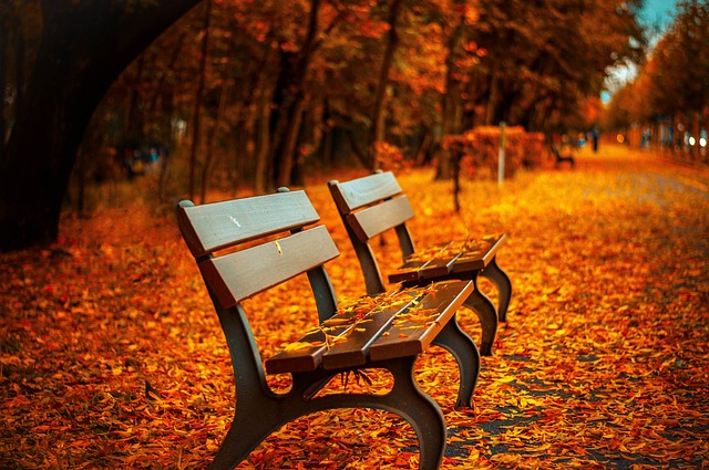
Rounded Images
You can make pictures look round using the border-radius property.
Thumbnail Images
You can employ the border property to make small preview pictures.
Thumbnail Image:
Thumbnail Image as Link:
Responsive Images
Images that are responsive will change their size to fit the screen they are displayed on.
Change the size of your web browser window to observe the outcome:
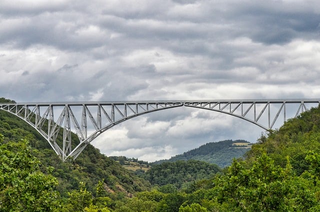
If you'd like an image to become smaller when needed but not become larger than its original size, use the following code in your HTML:
Tip: Learn more about making websites that work well on different devices in our CSS Responsive Web Design Tutorial.
Center an Image
To place an image in the middle, adjust its position by setting the left and right margins to "auto" and ensure it is a block element in your HTML code.
Polaroid Images / Cards
Transparent Image
You can set the Opacity property to a number between 0.0 and 1.0. A lower number makes something more see-through.
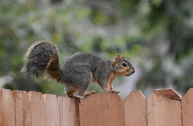
opacity 0.2
opacity 0.5
opacity 1
(default)
Image Text
How to place text on an image:
Image Filters
The CSS property called filter can be used to add special visual effects, such as blurring and changing colors, to an element on a web page.
Important Note: The filter property doesn't work in Internet Explorer or Edge 12.
Image Hover Overlay
Make a hover effect that adds an overlay.
Flip an Image
Hover your mouse pointer over the picture:
Responsive Image Gallery
You can use CSS to make picture collections. This sample uses media queries to arrange the pictures differently based on the size of the screen. Try changing the size of your web browser window to see what happens.
Add a description of the image here
Add a description of the image here
Add a description of the image here
Add a description of the image here
Hint: Learn more about making websites look good on different devices by checking out our CSS Responsive Web Design Tutorial.
<!DOCTYPE html>
<html>
  <head>
    <style>
      img {
        border-radius: 8px;
      }
    </style>
  </head>
  <body>
    <h2>Rounded Image</h2>
    <img src="/assets/files/benches.jpg" alt="Benches" width="300" height="300">
  </body>
</html>
<!DOCTYPE html>
<html>
  <head>
    <style>
      img {
        border-radius: 50%;
      }
    </style>
  </head>
  <body>
    <h2>Circled Image</h2>
    <img src="/assets/files/benches.jpg" alt="Benches" width="300" height="300">
  </body>
</html>
<!DOCTYPE html>
<html>
  <head>
    <style>
      img {
        border: 1px solid #ddd;
        border-radius: 4px;
        padding: 5px;
        width: 150px;
      }
    </style>
  </head>
  <body>
    <h2>Thumbnail Image</h2>
    <img src="/assets/files/benches.jpg" alt="Benches" style="width:150px">
  </body>
</html>
<!DOCTYPE html>
<html>
  <head>
    <style>
      img {
        border: 1px solid #ddd;
        border-radius: 4px;
        padding: 5px;
        width: 150px;
      }

      img:hover {
        box-shadow: 0 0 2px 1px rgba(0, 140, 186, 0.5);
      }
    </style>
  </head>
  <body>
    <h2>Thumbnail Image as Link</h2>
    <p>Employ the border attribute to generate small preview images. Enclose a hyperlink around the image for link functionality</p>
    <p>Hover over the image and click on it to see the effect.</p>
    <a target="_blank" href="paris.jpg">
      <img src="/assets/files/benches.jpg" alt="Benches" style="width:150px">
    </a>
  </body>
</html>
<!DOCTYPE html>
<html>
  <head>
    <style>
      img {
        max-width: 100%;
        height: auto;
      }
    </style>
  </head>
  <body>
    <h2>Responsive Image</h2>
    <p>Images that are responsive will adapt themselves to fit the screen size automatically.</p>
    <p>Resize the browser window to see the effect:</p>
    <img src="/assets/files/bridge.jpg" alt="Bridge" width="1000" height="300">
  </body>
</html>
<!DOCTYPE html>
<html>
  <head>
    <style>
      img {
        display: block;
        margin-left: auto;
        margin-right: auto;
      }
    </style>
  </head>
  <body>
    <h2>Center an Image</h2>
    <p>To position an image at the center, set both the left and right margins to auto and ensure it is a block element.</p>
    <img src="/assets/files/benches.jpg" alt="Benches" style="width:50%">
  </body>
</html>
<!DOCTYPE html>
<html>
  <head>
    <style>
      body {
        margin: 25px;
      }

      div.polaroid {
        width: 80%;
        background-color: white;
        box-shadow: 0 4px 8px 0 rgba(0, 0, 0, 0.2), 0 6px 20px 0 rgba(0, 0, 0, 0.19);
        margin-bottom: 25px;
      }

      div.container {
        text-align: center;
        padding: 10px 20px;
      }
    </style>
  </head>
  <body>
    <h2>Responsive Polaroid Images / Cards</h2>
    <div class="polaroid">
      <img src="/assets/files/bridge.jpg" alt="Bridge" style="width:100%">
      <div class="container">
        <p>Cinque Terre</p>
      </div>
    </div>
    <div class="polaroid">
      <img src="/assets/files/bridge.jpg" alt="Bridge" style="width:100%">
      <div class="container">
        <p>Northern Lights</p>
      </div>
    </div>
  </body>
</html>
<!DOCTYPE html>
<html>
  <head>
    <style>
      img {
        opacity: 0.5;
      }
    </style>
  </head>
  <body>
    <h1>Image Transparency</h1>
    <p>The opacity property tells us how see-through an element is. A lower value means it's more transparent:</p>
    <p>Image with 50% opacity:</p>
    <img src="/assets/files/fox-squirrel.jpg" alt="Fox" width="170" height="100">
  </body>
</html>
<!DOCTYPE html>
<html>
  <head>
    <style>
      .container {
        position: relative;
      }

      .topleft {
        position: absolute;
        top: 8px;
        left: 16px;
        font-size: 18px;
      }

      img {
        width: 100%;
        height: auto;
        opacity: 0.3;
      }
    </style>
  </head>
  <body>
    <h2>Image Text</h2>
    <p>Add some text to an image in the top left corner:</p>
    <div class="container">
      <img src="/assets/files/fox-squirrel.jpg" alt="Fox" width="1000" height="300">
      <div class="topleft">Top Left</div>
    </div>
  </body>
</html>
<!DOCTYPE html>
<html>
  <head>
    <style>
      body {
        background-color: white;
      }

      img {
        width: 33%;
        height: auto;
        float: left;
        max-width: 235px;
      }

      .blur {
        filter: blur(4px);
      }

      .brightness {
        filter: brightness(250%);
      }

      .contrast {
        filter: contrast(180%);
      }

      .grayscale {
        filter: grayscale(100%);
      }

      .huerotate {
        filter: hue-rotate(180deg);
      }

      .invert {
        filter: invert(100%);
      }

      .opacity {
        filter: opacity(50%);
      }

      .saturate {
        filter: saturate(7);
      }

      .sepia {
        filter: sepia(100%);
      }

      .shadow {
        filter: drop-shadow(8px 8px 10px green);
      }
    </style>
  </head>
  <body>
    <h2>Image Filters</h2>
    <p>
      <strong>Note:</strong> The filter property is not supported in Internet Explorer or Edge 12.
    </p>
    <img src="/assets/files/apple.jpg" alt="Apple" width="300" height="300">
    <img class="blur" src="/assets/files/apple.jpg" alt="Apple" width="300" height="300">
    <img class="brightness" src="/assets/files/apple.jpg" alt="Apple" width="300" height="300">
    <img class="contrast" src="/assets/files/apple.jpg" alt="Apple" width="300" height="300">
    <img class="grayscale" src="/assets/files/apple.jpg" alt="Apple" width="300" height="300">
    <img class="huerotate" src="/assets/files/apple.jpg" alt="Apple" width="300" height="300">
    <img class="invert" src="/assets/files/apple.jpg" alt="Apple" width="300" height="300">
    <img class="opacity" src="/assets/files/apple.jpg" alt="Apple" width="300" height="300">
    <img class="saturate" src="/assets/files/apple.jpg" alt="Apple" width="300" height="300">
    <img class="sepia" src="/assets/files/apple.jpg" alt="Apple" width="300" height="300">
    <img class="shadow" src="/assets/files/apple.jpg" alt="Apple" width="300" height="300">
  </body>
</html>
<!DOCTYPE html>
<html>
  <head>
    <style>
      .container {
        position: relative;
        width: 50%;
      }

      .image {
        display: block;
        width: 100%;
        height: auto;
      }

      .overlay {
        position: absolute;
        top: 0;
        bottom: 0;
        left: 0;
        right: 0;
        height: 100%;
        width: 100%;
        opacity: 0;
        transition: .5s ease;
        background-color: #008CBA;
      }

      .container:hover .overlay {
        opacity: 1;
      }

      .text {
        color: white;
        font-size: 20px;
        position: absolute;
        top: 50%;
        left: 50%;
        transform: translate(-50%, -50%);
        -ms-transform: translate(-50%, -50%);
      }
    </style>
  </head>
  <body>
    <h2>Fade in Overlay</h2>
    <div class="container">
      <img src="/assets/files/avatar.png" alt="Avatar" class="image">
      <div class="overlay">
        <div class="text">Hello World</div>
      </div>
    </div>
  </body>
</html>
<!DOCTYPE html>
<html>
  <head>
    <style>
      .container {
        position: relative;
        width: 50%;
      }

      .image {
        opacity: 1;
        display: block;
        width: 100%;
        height: auto;
        transition: .5s ease;
        backface-visibility: hidden;
      }

      .middle {
        transition: .5s ease;
        opacity: 0;
        position: absolute;
        top: 50%;
        left: 50%;
        transform: translate(-50%, -50%);
        -ms-transform: translate(-50%, -50%)
      }

      .container:hover .image {
        opacity: 0.3;
      }

      .container:hover .middle {
        opacity: 1;
      }

      .text {
        background-color: #4CAF50;
        color: white;
        font-size: 16px;
        padding: 16px 32px;
      }
    </style>
  </head>
  <body>
    <h2>Fade in a Box</h2>
    <div class="container">
      <img src="/assets/files/avatar.png" alt="Avatar" class="image" style="width:100%">
      <div class="middle">
        <div class="text">John Doe</div>
      </div>
    </div>
  </body>
</html>
<!DOCTYPE html>
<html>
  <head>
    <style>
      .container {
        position: relative;
        width: 50%;
      }

      .image {
        display: block;
        width: 100%;
        height: auto;
      }

      .overlay {
        position: absolute;
        bottom: 100%;
        left: 0;
        right: 0;
        background-color: #008CBA;
        overflow: hidden;
        width: 100%;
        height: 0;
        transition: .5s ease;
      }

      .container:hover .overlay {
        bottom: 0;
        height: 100%;
      }

      .text {
        white-space: nowrap;
        color: white;
        font-size: 20px;
        position: absolute;
        overflow: hidden;
        top: 50%;
        left: 50%;
        transform: translate(-50%, -50%);
        -ms-transform: translate(-50%, -50%);
      }
    </style>
  </head>
  <body>
    <h2>Slide in Overlay from the Top</h2>
    <div class="container">
      <img src="/assets/files/avatar.png" alt="Avatar" class="image">
      <div class="overlay">
        <div class="text">Hello World</div>
      </div>
    </div>
  </body>
</html>
<!DOCTYPE html>
<html>
  <head>
    <style>
      img:hover {
        transform: scaleX(-1);
      }
    </style>
  </head>
  <body>
    <h2>Flip an Image</h2>
    <p>Move your mouse over the image.</p>
    <img src="/assets/files/fox-squirrel.jpg" alt="Fox" width="400" height="300">
  </body>
</html>
<!DOCTYPE html>
<html>
  <head>
    <style>
      div.gallery {
        border: 1px solid #ccc;
      }

      div.gallery:hover {
        border: 1px solid #777;
      }

      div.gallery img {
        width: 100%;
        height: auto;
      }

      div.desc {
        padding: 15px;
        text-align: center;
      }

      * {
        box-sizing: border-box;
      }

      .responsive {
        padding: 0 6px;
        float: left;
        width: 24.99999%;
      }

      @media only screen and (max-width: 700px) {
        .responsive {
          width: 49.99999%;
          margin: 6px 0;
        }
      }

      @media only screen and (max-width: 500px) {
        .responsive {
          width: 100%;
        }
      }

      .clearfix:after {
        content: "";
        display: table;
        clear: both;
      }
    </style>
  </head>
  <body>
    <h2>Responsive Image Gallery</h2>
    <h4>Resize the browser window to see the effect.</h4>
    <div class="responsive">
      <div class="gallery">
        <a target="_blank" href="/assets/files/benches.jpg">
          <img src="/assets/files/benches.jpg" alt="Benches" width="600" height="400">
        </a>
        <div class="desc">Add a description of the image here</div>
      </div>
    </div>
    <div class="responsive">
      <div class="gallery">
        <a target="_blank" href="/assets/files/bridge.jpg">
          <img src="/assets/files/bridge.jpg" alt="Bridge" width="600" height="400">
        </a>
        <div class="desc">Add a description of the image here</div>
      </div>
    </div>
    <div class="responsive">
      <div class="gallery">
        <a target="_blank" href="/assets/files/fox-squirrel.jpg">
          <img src="/assets/files/fox-squirrel.jpg" alt="Fox" width="600" height="400">
        </a>
        <div class="desc">Add a description of the image here</div>
      </div>
    </div>
    <div class="responsive">
      <div class="gallery">
        <a target="_blank" href="/assets/files/plant.png">
          <img style="    max-height: 162px;" src="/assets/files/plant.png" alt="Plants" width="600" height="400">
        </a>
        <div class="desc">Add a description of the image here</div>
      </div>
    </div>
    <div class="clearfix"></div>
    <div style="padding:6px;">
      <p>This demonstration employs media queries to rearrange images based on various screen sizes. On screens wider than 700 pixels, it displays four images in a row, while on screens narrower than 700 pixels, it shows two images side by side. Additionally, on screens narrower than 500 pixels, the images will be stacked vertically, occupying 100% of the width.</p>
    </div>
  </body>
</html>
 HTML
HTML
 CSS
CSS
 Javascript
 Jquery