RWD Viewport
What is The Viewport?
The viewport is what you can see on a web page.
The viewing area changes depending on the device, and it's smaller on a mobile phone compared to a computer screen.
In the past, when there were no tablets or mobile phones, websites were created just for computers. Back then, most websites looked the same and stayed a fixed size.
When we began using tablets and mobile phones to browse the internet, web pages that had a set size were too big for the screen. To solve this, the web browsers on those devices made the whole web page smaller so that it could fit on the screen.
This wasn't ideal, but it was a fast solution.
Setting The Viewport
HTML5 brought in a way for web designers to manage the viewport using the tag.
In all your web pages, make sure to add this viewport element with its width and height attributes intact.
This tells the web browser how to manage the size and scaling of the webpage.
The width=device-width code makes the webpage's width adapt to the device's screen size, which can differ from one device to another.
The part that says initial-scale=1.0 determines how much the webpage is zoomed in when it's first opened in a web browser.
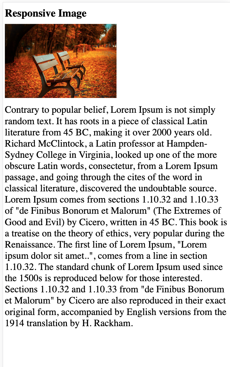
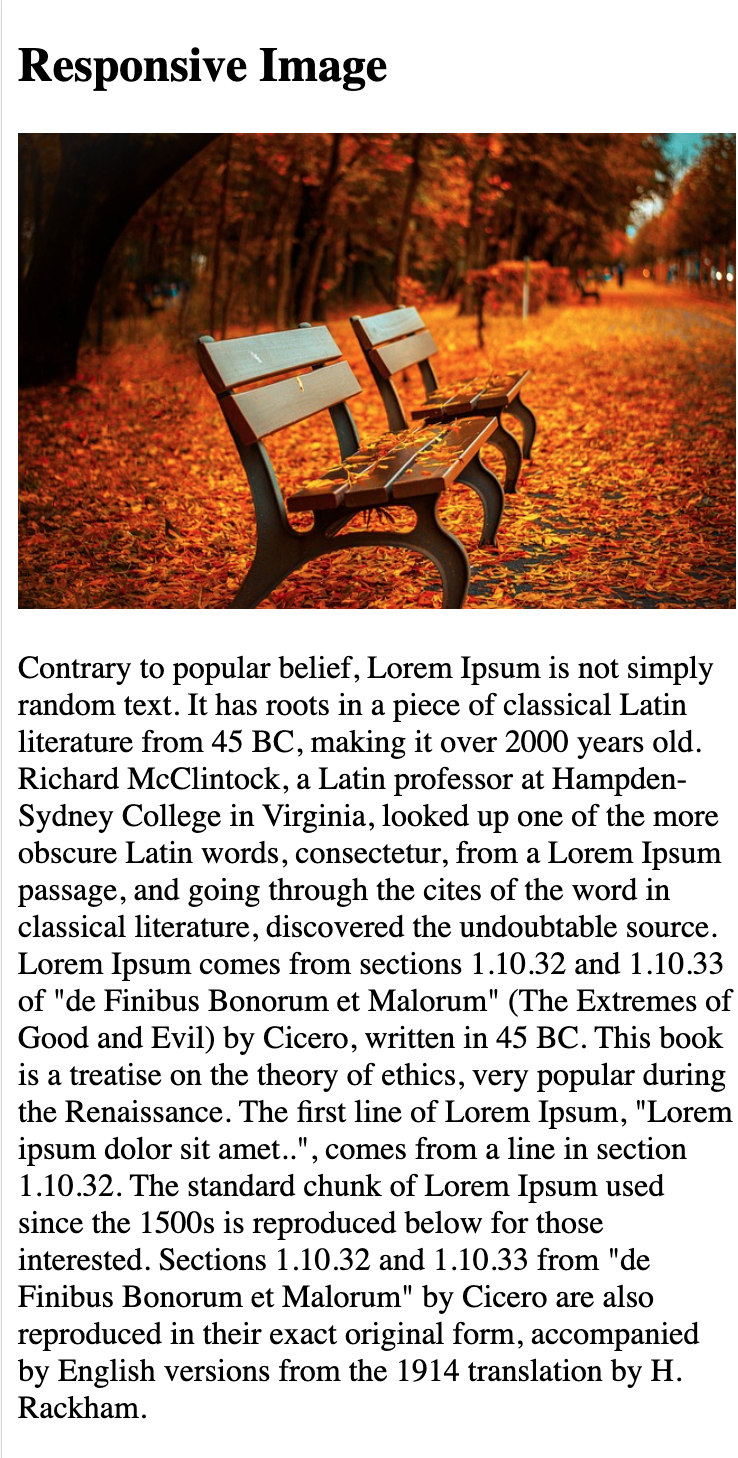
Here's a web page example without the viewport meta tag, and here's the same web page with the viewport meta tag. See the difference:
Tip: If you are browsing this page with a phone or a tablet, you can click on the two links above to see the difference.
Size Content to The Viewport
Most people are accustomed to scrolling websites up and down on their computers and mobile phones, but not from side to side!
If you have to move your screen sideways or make everything smaller to see the entire webpage, it makes the website not very user-friendly.
Here are a few more guidelines to keep in mind:
1. Avoid using big, inflexible elements - For instance, if an image appears wider than the screen, it may make the screen scroll sideways. Make sure to resize such content to fit within the screen's width.
2. Avoid depending on a specific screen size for content display - Because different devices have different screen sizes and CSS pixel widths, your content should not rely on a specific screen size to look good.
3. Make Your Website Look Good on All Screen Sizes - When designing your website, be mindful of how it appears on both small and large screens. If you set fixed widths for your page elements, they might be too wide on smaller devices. It's better to use relative width values, like width: 100%. Also, be cautious about using big positioning values, as they could make elements go beyond the screen on small devices.


 HTML
HTML
 CSS
CSS
 Javascript
 Jquery
 PHP
PHP
 MySQL
MySQL