RWD Intro
What is Responsive Web Design?
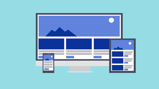
Responsive web design ensures your website appears attractive on every type of device.
Responsive web design relies on HTML and CSS alone.
Responsive web design is not a software or a piece of JavaScript code.
Designing For The Best Experience For All Users
Web pages can be seen on various devices like computers, tablets, and phones. Your webpage should appear nice and be simple to use, no matter what device someone uses.
Web pages should adjust their content to fit different devices instead of cutting out information for smaller screens.
Responsive web design means using CSS and HTML to change the size, visibility, or position of content so that it appears well on all types of screens.
Don't fret if you're having trouble grasping the example below. We'll dissect the code piece by piece in the upcoming chapters.
<!DOCTYPE html>
<html>
  <head>
    <meta name="viewport" content="width=device-width, initial-scale=1.0">
    <style>
      * {
        box-sizing: border-box;
      }

      .row::after {
        content: "";
        clear: both;
        display: table;
      }

      [class*="col-"] {
        float: left;
        padding: 15px;
      }

      html {
        font-family: "Lucida Sans", sans-serif;
      }

      .header {
        background-color: #9933cc;
        color: #ffffff;
        padding: 15px;
      }

      .menu ul {
        list-style-type: none;
        margin: 0;
        padding: 0;
      }

      .menu li {
        padding: 8px;
        margin-bottom: 7px;
        background-color: #33b5e5;
        color: #ffffff;
        box-shadow: 0 1px 3px rgba(0, 0, 0, 0.12), 0 1px 2px rgba(0, 0, 0, 0.24);
      }

      .menu li:hover {
        background-color: #0099cc;
      }

      .aside {
        background-color: #33b5e5;
        padding: 15px;
        color: #ffffff;
        text-align: center;
        font-size: 14px;
        box-shadow: 0 1px 3px rgba(0, 0, 0, 0.12), 0 1px 2px rgba(0, 0, 0, 0.24);
      }

      .footer {
        background-color: #0099cc;
        color: #ffffff;
        text-align: center;
        font-size: 12px;
        padding: 15px;
      }

      /* For mobile phones: */
      [class*="col-"] {
        width: 100%;
      }

      @media only screen and (min-width: 600px) {

        /* For tablets: */
        .col-s-1 {
          width: 8.33%;
        }

        .col-s-2 {
          width: 16.66%;
        }

        .col-s-3 {
          width: 25%;
        }

        .col-s-4 {
          width: 33.33%;
        }

        .col-s-5 {
          width: 41.66%;
        }

        .col-s-6 {
          width: 50%;
        }

        .col-s-7 {
          width: 58.33%;
        }

        .col-s-8 {
          width: 66.66%;
        }

        .col-s-9 {
          width: 75%;
        }

        .col-s-10 {
          width: 83.33%;
        }

        .col-s-11 {
          width: 91.66%;
        }

        .col-s-12 {
          width: 100%;
        }
      }

      @media only screen and (min-width: 768px) {

        /* For desktop: */
        .col-1 {
          width: 8.33%;
        }

        .col-2 {
          width: 16.66%;
        }

        .col-3 {
          width: 25%;
        }

        .col-4 {
          width: 33.33%;
        }

        .col-5 {
          width: 41.66%;
        }

        .col-6 {
          width: 50%;
        }

        .col-7 {
          width: 58.33%;
        }

        .col-8 {
          width: 66.66%;
        }

        .col-9 {
          width: 75%;
        }

        .col-10 {
          width: 83.33%;
        }

        .col-11 {
          width: 91.66%;
        }

        .col-12 {
          width: 100%;
        }
      }
    </style>
  </head>
  <body>
    <div class="header">
      <h1>Chania</h1>
    </div>
    <div class="row">
      <div class="col-3 col-s-3 menu">
        <ul>
          <li>The Flight</li>
          <li>The City</li>
          <li>The Island</li>
          <li>The Food</li>
        </ul>
      </div>
      <div class="col-6 col-s-9">
        <h1>The City</h1>
        <p>Lorem Ipsum is simply dummy text of the printing and typesetting industry. Lorem Ipsum has been the industry's standard dummy text ever since the 1500s, when an unknown printer took a galley of type and scrambled it to make a type specimen book.</p>
      </div>
      <div class="col-3 col-s-12">
        <div class="aside">
          <h2>What?</h2>
          <p>Chania is a city on the island of Crete.</p>
          <h2>Where?</h2>
          <p>Crete is a Greek island in the Mediterranean Sea.</p>
          <h2>How?</h2>
          <p>You can reach Chania airport from all over Europe.</p>
        </div>
      </div>
    </div>
    <div class="footer">
      <p>Resize the browser window to see how the content respond to the resizing.</p>
    </div>
  </body>
</html>
 HTML
HTML
 CSS
CSS
 Javascript
 Jquery